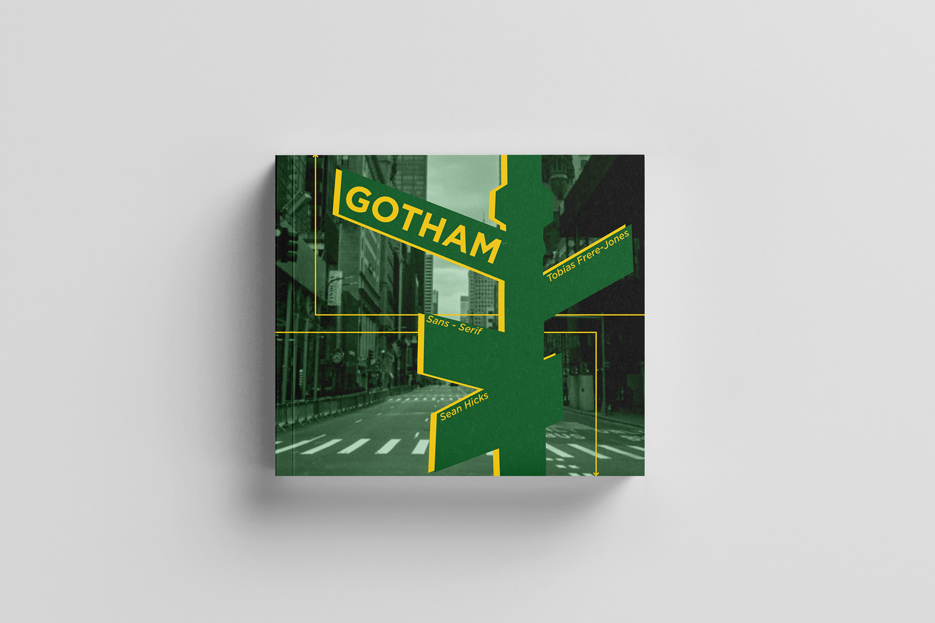
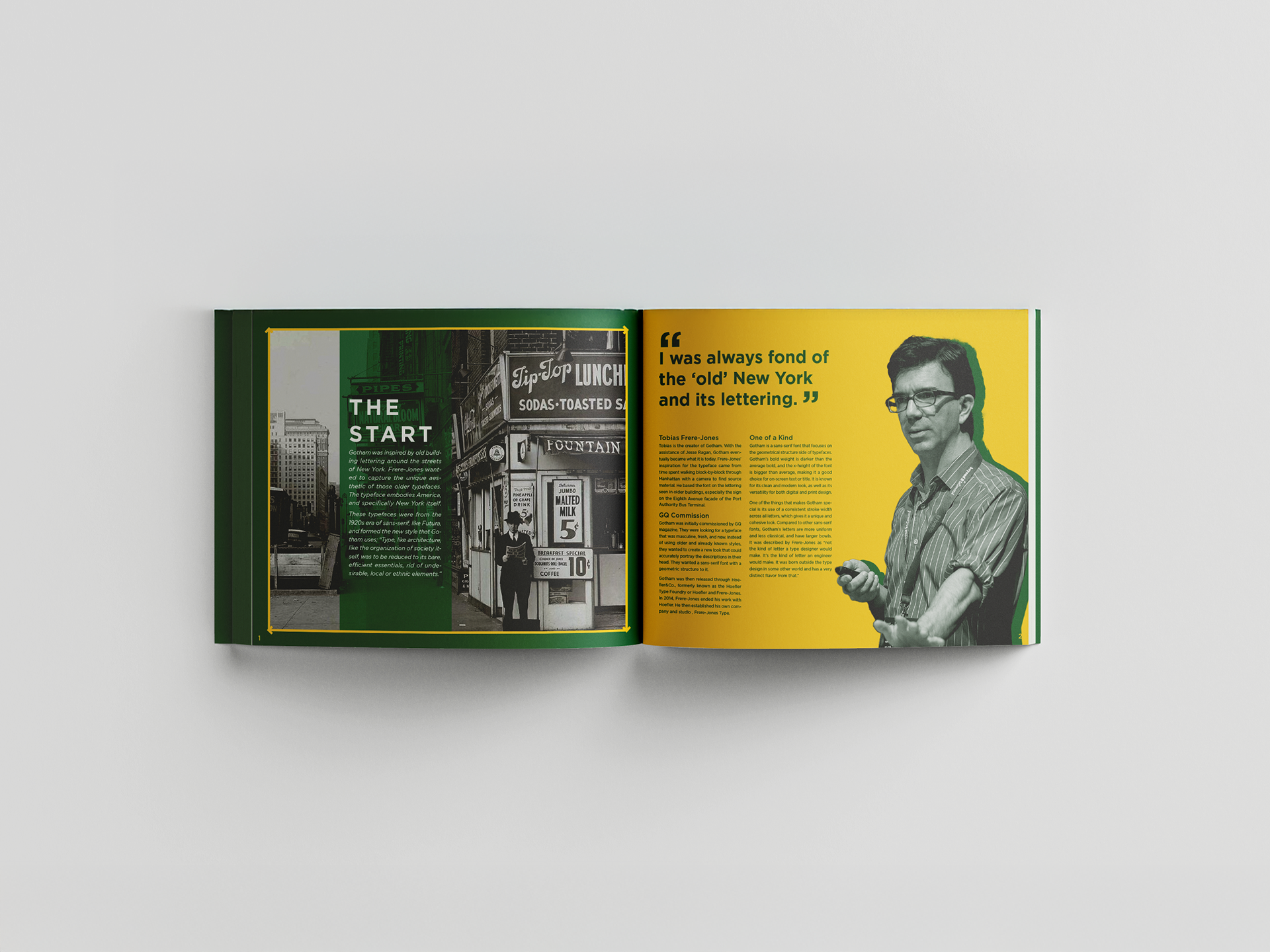
ABOUT This typographic book examines the origins, anatomy, and influence of Gotham, a typeface created for GQ magazine to embody a masculine, fresh, and modern voice.
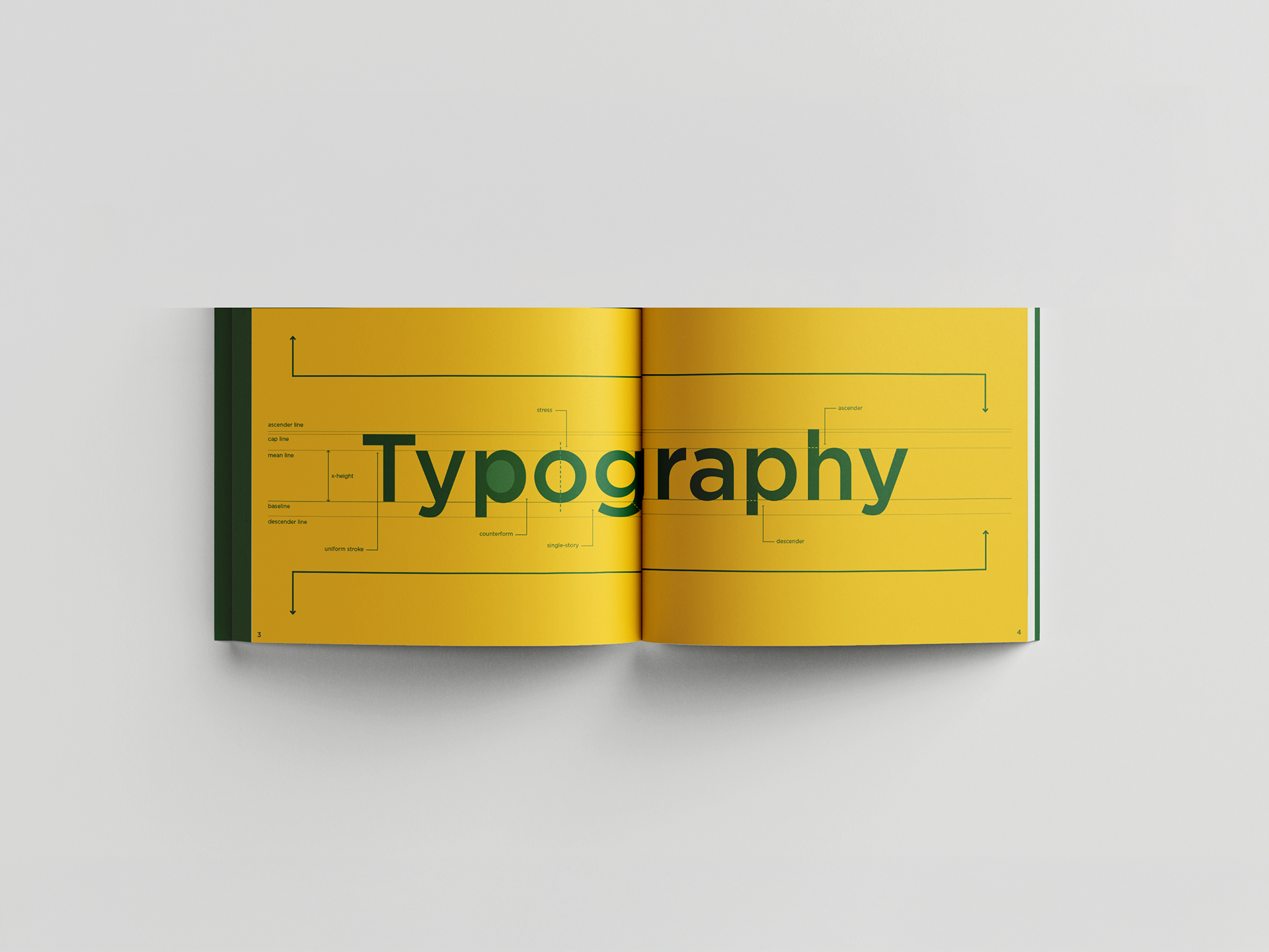
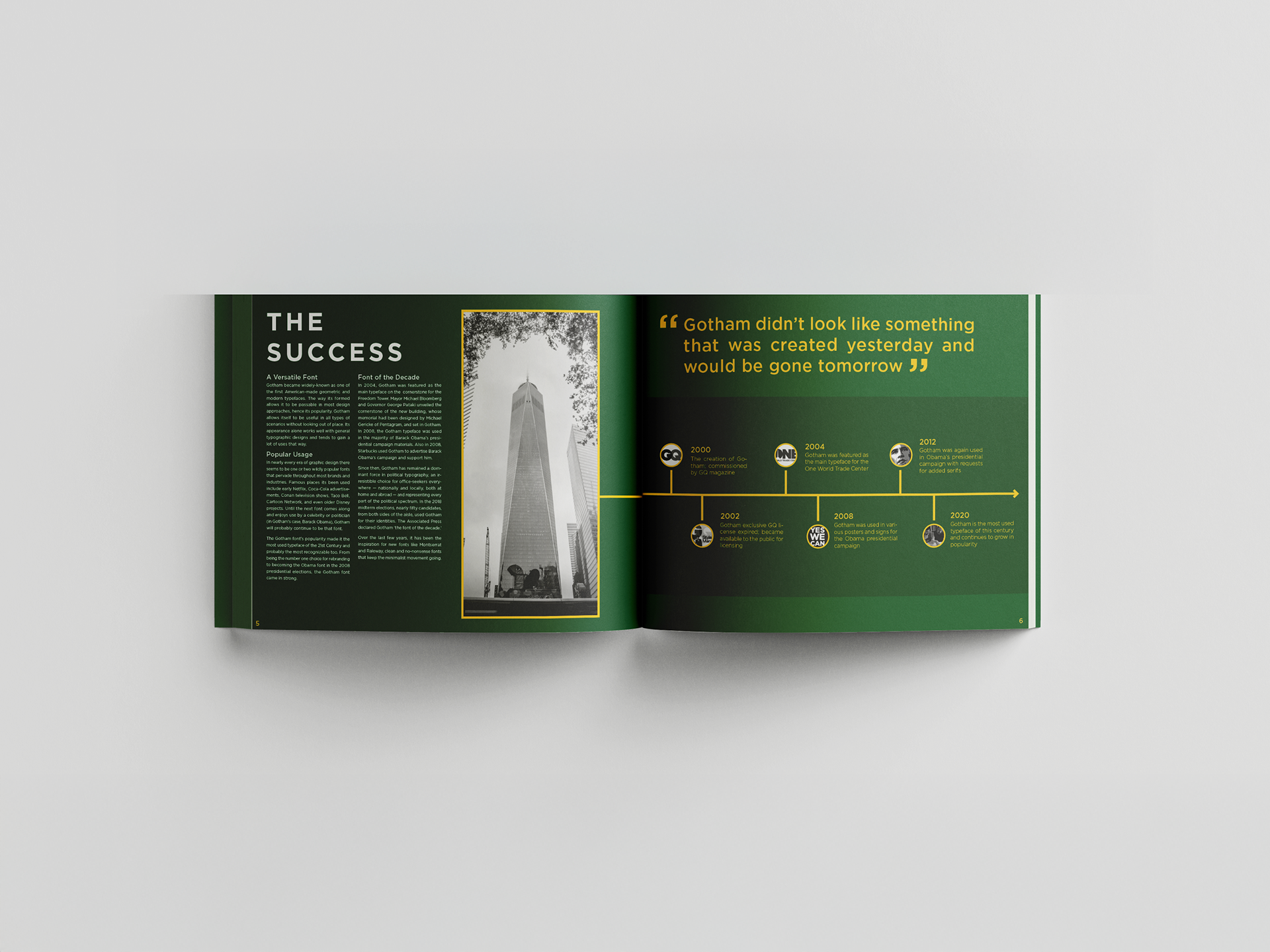
INTENT Inspired by the geometric precision of early twentieth-century New York City signage, the book reflects this heritage through a cover and layout that subtly reference architectural lettering and urban signforms. Inside, it traces Gotham’s development from its vernacular roots to its refined structure of open counters and balanced geometry, then explores its cultural impact across media, branding, and major political campaigns.
DESIGN Clean grids, thoughtful hierarchy, and consistent nods to city signage unify the publication, presenting a focused study of how Gotham became a defining presence in contemporary design through clarity, confidence, and versatility.